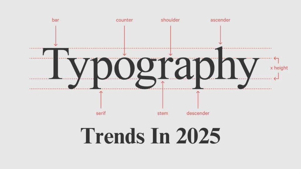
Typography Trends in 2025
A Brief History of Typography’s Transformation
Typography is more than the decoration or design of a word that appears on paper. Typography encompasses the feelings, emotions and the meaning behind the text itself. Face it; it’s equally as critical as the text itself. Picture this moment – you’re scrolling through your favourite blog and see something stunning typed over a lovely background that pulls your attention. Instantly, you are captivated. So, what year in 2025 does typography have in store? Well, put on your seatbelts because we are about to dive deep!
Why Are All The Fonts Using Different Graphics Designs?
What is meant by the term Variable Fonts?
Fonts can perform multiple functions and are considered the Swiss Army of Typography. One can get different styles and designs through a single font file with the showcase font. Can the typeface’s weight, width, and slant be in a single click? That’s awesome! All of this will be possible regarding efficiency and style in 2025.
The Importance
So, why should you care about these fonts? Well, for one, they can help solve the problem of space! When we talk about web performance, we’re referring to how quickly a website loads and how smoothly it runs. These fonts can contribute to faster loading times. Plus, they offer a level of configurability that designers are excited about. It’s like having a personal stylist for your text!
The Return Of Bold Fonts
Different Kinds of Nostalgia
Thick fonts are gradually getting back into the spotlight! Think about the font type used in the bold-fronted classical newspapers. It was accentuated with the phrase, “Read Me!” which, for people, was hard to ignore. These phrases will, at long last, have their place in design again in 2025.
Bold Fonts As A Means Of Communication
Thick letters are said to impart authority. Thick letters are intimidating and assertive, precisely the impression you want to make. In this case, being transparent with your message is everything. It is an overpopulous world in which information grabs attention – even if it is dim.
Minimalism With a Twist
Less is More
Minimalism has been around for a while now, but it’s set to receive a unique twist in 2025. This includes crisp lines, lots of white space, and gentle fonts. It looks like a breath of fresh air!
The Power of Negative Space
One of the most important design principles to embrace is ‘negative space’. This is the empty space around and between the elements of your design. It allows your typography to stand out and be seen. Think of it as giving your words room to breathe and move around! Good design is all about balance and having the right amount of everything.
Playful Typography
Fun with Fonts
Typography in 2025 will also welcome the whimsy. There will be a lot more personality in forehand and quirky fonts. It’s like painting an otherwise dull black-and-white photograph.
Engaging the Audience
Why not have some fun? Creative fonts and vibrant colours invite your audience to participate in a way a Times New Roman font cannot. It makes them want to engage with the content.
Interactive Typography
The Future is Now
By 2025, there will be a whole new world of typography. Texts would move and change seamlessly, allowing users to interact with it. Having a conversation with your audience aurally will become a reality!
Creating Experiences
Interactive typography can make experiences unforgettable. Think of it as a piece of text changing its size and colour as you scroll down. It is engaging, to say the least; it is ever-changing and the future of design.
Conclusion: What’s Next?
However, I don’t know what 2025 holds for typographers. Flexibility, boldness, minimalism, playfulness, and interactivity will be factors. As designers and content creators, we must take these trends up to offer spellbound experiences to our audience.
Are You Ready to Jump In?
Are you ready to jump into this new realm of typography? These new changes and trends are bound to make waves in the design world, so it is always better to be ahead of the pack. Buckle up because there is a lot of embracing to do!
Let’s make 2025 a year of stunning typography!
Emerging Trends in Typography
Emerging Trends in Typography
1. Eco-Friendly Fonts
What Are Eco-Friendly Fonts?
As sustainability becomes a priority, eco-friendly fonts made from recycled materials or designed to use less ink are emerging. This trend not only looks good but feels good, too! It’s about making choices that are kind to our planet.
Why Go Green?
Using eco-friendly fonts can reflect your brand’s commitment to sustainability. It’s a small change that can have a significant impact. Plus, consumers are more likely to support brands that share their values.
2. Custom Fonts for Brands
The Unique Touch
More brands are investing in custom fonts to stand out in the crowded marketplace. A unique typeface can become part of a brand’s identity, much like a logo.
Building Recognition
When people see a custom font, they immediately think of the brand. It’s like recognizing a friend from a distance. This trend is all about creating a lasting impression.
3. Retro Typography
Nostalgia in Design
Retro typography is coming back, drawing inspiration from the 70s, 80s, and 90s. It evokes nostalgia and can create a strong emotional connection with the audience.
Blending Old with New
This trend combines retro styles with modern design elements, creating a fresh yet familiar look. It’s like wearing vintage clothes with a contemporary twist!
4. Personalized Typography
Tailoring to the Audience
Personalized typography is rising, where fonts are adapted based on user data or preferences. It’s about making the experience more relevant to the individual.
Engaging the User
When users feel that content is tailored to them, they’re more likely to engage. It’s like having a conversation that feels personal and meaningful.
5. Text as Art
Typography Meets Visual Art
In 2025, we’ll see typography being used as art. Designers will experiment with text placement, colours, and styles, creating stunning visuals beyond words.
Captivating the Audience
This trend blurs the line between design and art, capturing the audience’s attention and inviting them to explore deeper. It’s about creating a visually captivating experience.
Conclusion
As we look ahead, these emerging typography trends will shape how we communicate visually. From eco-friendly options to personalized experiences, the future of typography is bright and full of possibilities. Are you ready to embrace these changes and elevate your designs?
Implementing Emerging Typography Styles
Implementing Emerging Typography Styles
1. Eco-Friendly Fonts
How to Implement
- Research Options: Start by researching eco-friendly fonts available for commercial use. Many font foundries now offer sustainable options.
- Test Ink Usage: Select fonts designed to use less ink when printing. This can significantly reduce your carbon footprint.
- Promote Your Choices: Share your commitment to sustainability with your audience. Use social media and your website to highlight the eco-friendly aspects of your typography.
2. Custom Fonts for Brands
How to Implement
- Hire a Designer: Collaborate with a type designer to create a custom font that reflects your brand’s personality. This investment can pay off in brand recognition.
- Create a Style Guide: Once you have your custom font, include it in your brand style guide to ensure consistency across all platforms.
- Incorporate Gradually: Start using your custom font in less critical areas, like social media graphics, before rolling it out across your website and print materials.
3. Retro Typography
How to Implement
- Choose a Theme: Decide on a specific era or style you want to replicate. This will guide your font selections and design choices.
- Mix and Match: Combine retro fonts with modern design elements to create a balanced look. This can include using retro fonts for headlines while keeping body text contemporary.
- Experiment with Colors: Use colour palettes that reflect the chosen era to enhance the retro feel. Think bold colours and playful combinations!
4. Personalized Typography
How to Implement
- User Data Analysis: Collect data on your audience’s preferences and behaviors. This can inform how you customize typography for different segments.
- Dynamic Fonts: Use web technologies that allow for dynamic font changes based on user interaction or preferences.
- A/B Testing: Try different personalized typography styles to see what resonates best with your audience. This iterative approach can lead to better engagement.
5. Text as Art
How to Implement
- Creative Freedom: Allow designers to experiment with text as a central visual element. Please encourage them to think outside traditional typography norms.
- Incorporate into Marketing: Use text as art in your marketing materials, such as social media posts and advertisements, to create eye-catching visuals.
- Collaborate with Artists: Engage with visual artists to create unique designs that blend typography with artistic expression. This can lead to innovative and memorable content.
Conclusion
Implementing these emerging typography styles requires creativity, research, and collaboration. By staying ahead of the trends and adapting your typography to meet modern expectations, you can create engaging and memorable experiences for your audience. Are you ready to dive in and transform your designs?
Brands Leading the Typography Trend
Brands Leading the Typography Trend
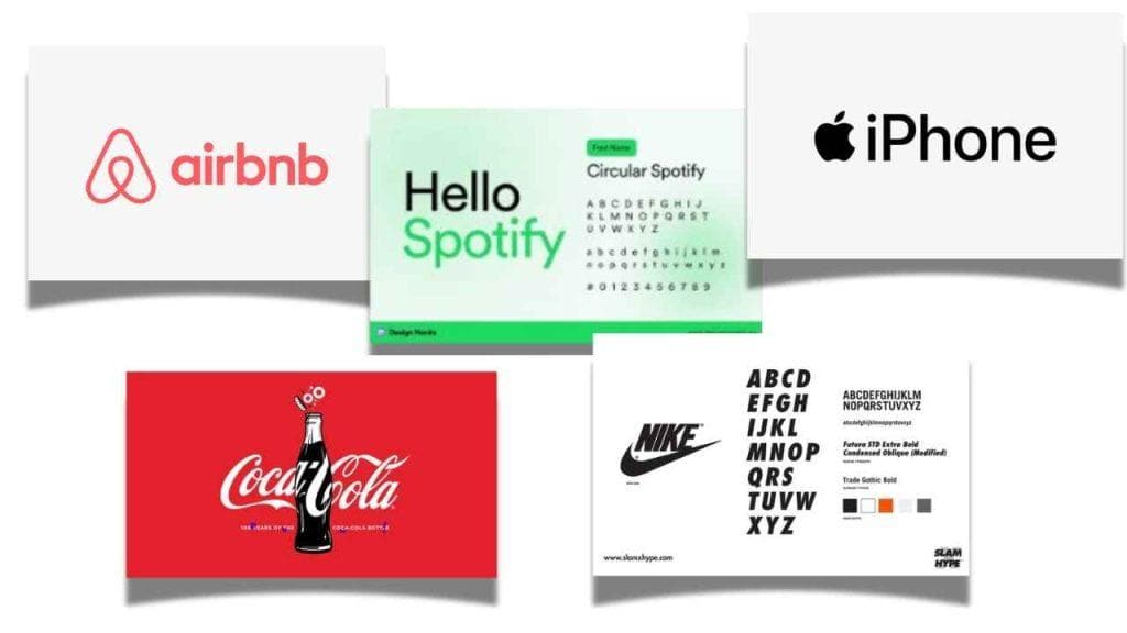
1. Airbnb
Embracing Custom Typography
Airbnb has developed its custom typeface called “Cereal.” This font reflects the brand’s unique personality and is used across all its platforms, enhancing brand recognition and creating a cohesive visual identity.
2. Spotify
Bold and Playful Choices
Spotify utilizes bold and playful typography in its marketing materials and app interface. Combining thick fonts and bright colours effectively captures attention and conveys a sense of fun and energy that aligns with its brand.
3. Apple
Minimalism and Elegance
Apple is known for its clean and minimalist design, utilizing sleek typography that complements its products. The brand’s use of San Francisco, a custom typeface, highlights its commitment to simplicity and functionality.
4. Coca-Cola
Nostalgic and Timeless
Coca-Cola’s iconic Spencerian script is a perfect example of retro typography that has stood the test of time. The brand consistently uses its classic font in marketing campaigns, evoking feelings of nostalgia and familiarity.
5. Nike
Dynamic and Engaging
Nike often employs dynamic typography that reflects movement and energy. Its “Just Do It” slogan is typically displayed in bold, impactful fonts, making it instantly recognizable and motivating.
Conclusion
These brands are leading the typography trend and setting standards for creativity and innovation in design. By embracing unique fonts and styles that resonate with their audience, they continue to strengthen their brand identities. Are you ready to take inspiration from these leaders and elevate your typography game?